Fintech Education · Marketing Site
Stock Market Training Academy
A dark, terminal-inspired marketing site for a Hyderabad-based trading educator with 15+ years of real market experience.
Problem
A credible educator, competing in a market full of noise
Search "learn stock trading" and most results look the same: loud promises, fake urgency, screenshots of profits with no context. This academy's founder has 15+ years of genuine trading experience and teaches options, intraday, and NIFTY/SENSEX strategy the way professional desks actually operate — but none of that came through on a generic template site. The brief was to build something that signals seriousness before a visitor reads a single word of copy.
Solution
A dark, trading-terminal aesthetic instead of a typical course-sales page
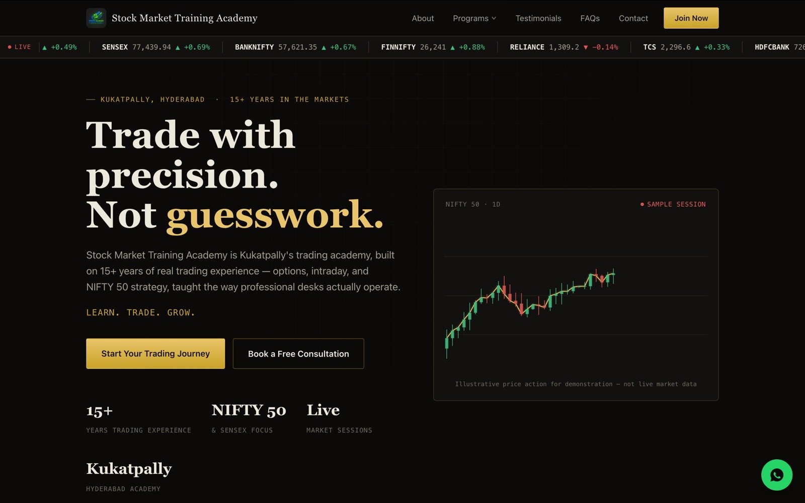
Rather than the bright, testimonial-heavy layout most course sites default to, I designed the homepage around a dark palette, a live-feeling market ticker, and an illustrative candlestick chart — visual language borrowed from an actual trading terminal rather than a marketing template. Every illustrative data point is labeled honestly as sample data, which matters both for trust and for compliance in financial marketing.
Key features
What the site does
- Scrolling index ticker bar for immediate market-native visual credibility
- Clearly labeled illustrative price chart, honest about not being live data
- Program breakdown, testimonials, and FAQ sections structured to build trust before asking for commitment
- WhatsApp and consultation-booking CTAs suited to how local students actually reach out
- Fast-loading dark theme tuned for both desktop research and mobile browsing
Approach
Development approach
I spent time with the founder understanding what actually separates a serious trading educator from the noise — specificity, honesty about risk, and a track record — then designed the site to communicate exactly that instead of generic "financial freedom" messaging. The ticker and chart components are lightweight, native-feeling widgets built to load fast and never claim to be something they're not.
Result
A site that looks like it was built by someone who trades, not just markets
The finished site gives the academy a professional, credible front door that matches the founder's actual experience — and a clear, low-friction path for prospective students to start a conversation instead of bouncing off another generic sales page.
Interested in something similar?
I take on a limited number of freelance projects each quarter.